Comprehensive Data Visualization with Tableau
Overview
I recently completed a project for a client where I developed a series of interactive Tableau dashboards. The goal was to transform complex datasets into easy-to-understand visualizations that could be used to make informed business decisions.
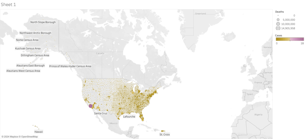
Dashboard 1: COVID-19 Impact by Country (2022)
This dashboard provides a detailed view of the global impact of COVID-19 in 2022. It visualizes the number of cases and deaths across various countries, with color gradients and dot sizes representing the severity of the pandemic in different regions. This visualization allowed the client to easily assess which areas were most affected, helping them to strategize resource allocation and response efforts.
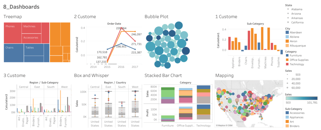
Dashboard 2: Sales and Profit Analysis
The second dashboard focuses on a detailed analysis of sales and profit data across different regions, categories, and sub-categories. It includes a variety of visual elements:
- Treemap: Breaks down sales by product categories.
- Bubble Plot: Highlights key trends in sales over time.
- Stacked Bar Chart: Compares sales and profit across various categories.
- Mapping: Geographically represents sales data, providing a visual summary of performance by location.
These visualizations enabled the client to quickly identify profitable areas and understand the distribution of sales across different segments, facilitating more effective business planning.
Conclusion
Through these Tableau dashboards, I was able to deliver powerful insights to my client, making complex data easily digestible and actionable. If you’re interested in similar solutions for your business, feel free to reach out!